Common measures to gauge people’s happiness in agile environments work well for individual teams. But in larger settings, even with just a few teams, things get harder.
The analogue tools used by individual agile teams simply don’t scale well.
When you’re in a scaled agile environment, you need different tools to get the same kind of benefits — the nuance and actionable insights — at aggregate levels that are so readily available in a single team.
Let’s see why that is, and what you can do about it, starting with some of the common ways to measure team happiness.
8 common ways to measure happiness
Agile favors a mindset and a way of working centred, ideally, around:
- Openness and transparency which requires courage and trust.
- Face-to-face communication in the same space.
- Improving toward perfection on all fronts, including a team’s wellbeing and happiness.
- Simplicity -- doing the simplest thing that works.
It’s why many agile coaches and agile articles promote simple, analogue ways of measuring happiness.
1. Team Happiness Index
A very common method for evaluating a team’s happiness is to use an index or rating, generally using a 1-5 scale, where 1 is Discouraged, 2 is Unsatisfied, 3 is Acceptable, 4 is Motivated, and 5 is Enthusiastic.
How often teams do this varies. Some teams do it in their daily meetings, others start their retrospectives with it — reflecting on the past iteration.
When teams rate daily, they usually track it on a graph or chart displayed in their team space or using a spreadsheet.
2. Crisp Happiness Index
The Crisp Happiness Index is a variation of the basic happiness index used at Crisp. It’s kept in a spreadsheet and adds various columns. One is a timestamp of the last update to someone’s row. The others allow team members to enter comments on what feels best and worst to them, what would increase their happiness index, and any other comments.
At Crisp they track the average rating’s history and correlate it to specific events at the company and in the team.
3. Niko-Niko calendar
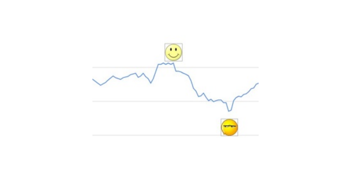
Very similar to a daily happiness index is using a Niko-Niko calendar. Team members rate their happiness with emoticons on a chart showing the days in an iteration or a full month. The choice of emoticons is usually limited to unhappy, neutral, and happy.
4. Happiness door
A happiness door is a place to collect feedback on happiness levels in a strategic place, for example near the exit of a team space or room.
Usually, the space on the door, or a flipchart next to it is divided into lanes corresponding to the happiness levels you want to track — for example the 5 points of the happiness index.
Team members can paste sticky notes with their reason for their rating into the lane that reflects their happiness index.

5. Happiness buckets
A simple way to measure happiness is to put a large container near the exit and fill it with enough tokens for everyone, for example with tennis balls. Next to it you place two buckets: a happy bucket and an unhappy bucket. On their way home, people pick a tennis ball from the container and drop it in the bucket that matches their happiness.
6. Quick surveys
Teams can run a specific happiness retrospective meeting, starting with a short and sweet survey, or use the survey at every retrospective and make it the topic for the meeting when the results warrant it.
The survey questions are:
- On a scale of 1 to 5, how happy are you with your role?
- On a scale of 1 to 5, how happy are you with your team?
- On a scale of 1 to 5, how happy are you with the company?
- What could we do in the next iteration that would make you happier?
7. Net Promoter Score
With this instrument, team members fill out a form with their rating for their happiness at each retrospective (i.e. every iteration) on a 1-10 point scale, just like the NPS in customer surveys. The twist is that they also fill out their reason for the score, the more specific, the better.
Only team members get all the information, managers only get the NPS score and a one-line summary of the reasons, as approved by the team.
8. Spotify team health check
Spotify asks all its teams to rate their “health” in multiple areas. Teams rate each on a three-point scale — green, yellow, and red — and also indicate whether things are improving, getting worse, or are stable.
For a quick overview of how multiple teams are faring, it’s easy to plot each team’s results in a table with the areas listed vertically and a column for each team, or squad in Spotify terminology.
The unique thing about the Spotify team health check is that it provides specific statements for each rating (awesome, no disasters, crappy) and illustrates what green and red look like for each area. These statements are pretty polarizing.
For example, in the area of “Learning”, green is illustrated as “We’re learning lots of interesting stuff all the time!” and red as “We never have time to learn anything.”
8 challenges raining on your happiness measuring
The analogue instruments and basic digital spreadsheets for measuring happiness work well in individual teams.
But how do they fare when it comes to multiple teams?
1. Remote working and distributed teams
Many teams are distributed around the globe and even when the team is in a single place, it’s often remote from the location of their stakeholders.
Analogue measuring isn’t up to the job for these teams. At least not without a lot of extra work or tech.

2. Two extremes
Take the happiness buckets. You can do that at a team level or you can do it at a more aggregate level, such as a whole development department or even a company.
Trouble is that as you scale up, you lose the nuance at the team level.
When you only have a few teams, it’s easy to cope with. You simply measure at the team level and spend a few minutes to aggregate the results.
But in a scaled agile environment you’d have to choose between granular team views and laboriously creating an overall picture, or an overall picture without the ability to drill down. There’s nothing in between — at least not without asking people to record their ratings more than once.
3. Rating trends
Analogue measuring tends to give you snapshots of moments in time. It doesn’t lend itself very well to charting history and spotting trends.
True, it’s not rocket science to collect results in a spreadsheet and plot them in a graph, but it still takes work that few find satisfying.
And if you want to correlate happiness levels with events in a team, the company, or the world in which they operate, you have even more work to do.
And yes, the Spotify team health check tries to address this with trend arrows, but a teams’ self-assessment on this is not an actual trend.
4. Lack of nuance
Most analogue measures of happiness are coarse-grained, using a 5-point or even just a 3-point scale.
The danger with that is that you end up with a lot of neutrals or 4s. And that simply doesn’t tell you very much.
Scales with few points are unable to pick up on the nuances that exist in everyday life and work. Even a 10-point scale is susceptible to this.
Harkn started with a 10-point scale and found that most people put themselves at a 7 most of the time. It was only when they changed to a 100-point scale that nuance in ratings showed up.
Also, with a limited set of points, you need average ratings with a couple of decimals to spot gradual changes. And that means that you can only see trends when you aggregate and average enough individuals.
Using a 100-point scale has enabled Harkn to spot slow drops for small teams and even for individuals.
5. Skewed ratings
Most analogue measures are used infrequently. Yes, I know, measuring happiness at every retrospective seems often enough, but actually it isn’t.
People know how they feel “in the moment”. They have a much harder time recollecting how they felt even after just a couple of days, let alone the length of an iteration. And their assessment of whether their happiness is improving or declining doesn’t fare much better.
This means that unless you’re measuring at least daily, everyone’s ratings get skewed through the recency bias and current mood bias that we’re all afflicted with.
6. Peer pressure
Analogue measures more often than not ask people to stand up in front of their peers and declare publicly how they feel or felt.
That’s hard enough as it is. When someone’s rating would be different from that of those before them, it becomes even harder.
As long as people are willing to ignore obvious signs that they should leave a room, such as smoke coming in around the door, just because the other people present (actors) pretend nothing is happening, you can rest assured that publicly rating how you felt is fraught with pressure to confirm.
No amount of stating that you want people to own their opinions is going to change that.
7. Psychological (Un)Safety
If happiness measuring tools are set up to collect the why behind someone’s rating, they often, if not always, require them to do so publicly.
For example, by entering their rating and comments in a row with their name on it. Or, even more publicly, by getting them to stand up in front of their peers and posting their comments on a sticky somewhere. Even if someone manages to do that without being seen, their handwriting usually reveals them.
Sharing your why, your feelings, is even harder than sharing your rating publicly. We’ve after all been brought up to hide our feelings — certainly at work. Mustering the courage to speak your mind is easier said than done, especially when your why is less than glowingly positive.
It’s why there’s a lot of emphasis on creating psychological safety in teams and organizations. The thing is though that the trust that’s needed to feel psychologically safe is in constant ebb and flow, changing with every interaction you have or witness.
8. Lack of meaningful context
If you want to know the ‘why’ behind ratings, you need to do more than get people to rate their happiness. You need to give them the means to state why they rated as they did.
Several of the happiness measuring instruments discussed above allow for this. However, they don’t often collect any history. A happiness door gets cleared regularly and even the Crisp Happiness Index only keeps the most recent comments.
This means you’re unable to see changes in what influences people’s ratings over time. You can be at a stable 4, and have no indication whether actions you took had no effect, or the reasons for the 4 have changed.
What if you could have it all? Live, digital, actionable employee insights?
So, as you can see, analogue happiness measures and their spreadsheet-supported incarnations have challenges. In and of themselves and even more so when you want to benefit from the in-scaled agile organisations. You either lose nuance or have a hard time collecting and aggregating the data across many teams.
But what if there’s another way?
One that lets you have your cake and eat it too.
A way that:
- Gives you a real-time pulse of and insight into everyone’s experience.
- Shows you how happiness differs across departments and teams without adding to the burden of collecting the data.
- Lets you explore aspects of departments’ and teams’ performance and experience frequent, short pulse surveys. Lets you draw from a bank of questions and create your own, and show results in relation to respondents’ mood when they answered.
- Collects and presents data in a cadence consistent with your iteration length, so you can spot cyclical trends, explore scores and influencers during a retrospective, and come up with questions for pulse surveys to dig for more clues.
- Lets you spot small and gradual changes over time that are completely lost using the black-and-white tennis ball buckets, standard smileys, or even 10-point scales.
- Has psychological safety baked into it through anonymity. And safeguards it against compromise through social knowledge. So no one would feel even the slightest hesitation to be completely frank and honest, and can even feel comfortable talking about ‘taboo’ subjects such as mental health.
- Collects people’s thoughts about what influenced their score, to gain insight into what drives happiness for people in your company, so leaders and individuals can take ownership of informed actions to consolidate what works and improve what doesn’t.
- Shows the thoughts people entered in a way that lets others respond, with emojis and comments, to give and receive celebrations, laughs, and support.
- Ties happiness scores to events inside and outside your company, so leaders get even more context with changes in scores.
- Gives everyone real-time access to their own (team) data and to aggregates that include their peers, so everyone is reading from the same book.
Just imagine what you could do with all that!
How you could stem the tide of gradual decline, augment a gradual rise, and learn about changes in what influences people’s happiness and wellbeing when things are stable.
Harkn gives organisations all that and more, it turns out.
Our live employee listening tools including the Daily Check-In, The Wall and the Good Day Ratio give you unparalleled insight into sentiment inside your organisation at any given moment.
Go digital for agile employee happiness measuring
Analog measurements of happiness are easy to use and have a lot of charm — after all, who doesn’t like emoticons and weather analogies for team mood and personal happiness gauges.
But as you’ve read, going digital has even more advantages, especially scaled agile environments and organizations spread around the globe.
So, go digital and reap those benefits.
You can gain a fuller understanding of our employee listening capabilities here. See Harkn in action with a demo or chat to us over a virtual coffee at a time that suits you.